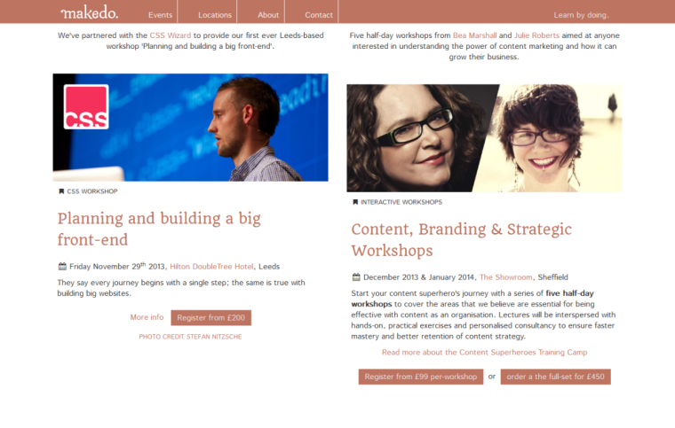
I just pushed out a small update to the Make Do website with the intention of:
- Cleaning up some redundant elements
- Implemented a brighter colour scheme
- New page/navigation structure
- Simpler event listings
- ‘Event card’ element hacking
‘Event cards’ colour variations
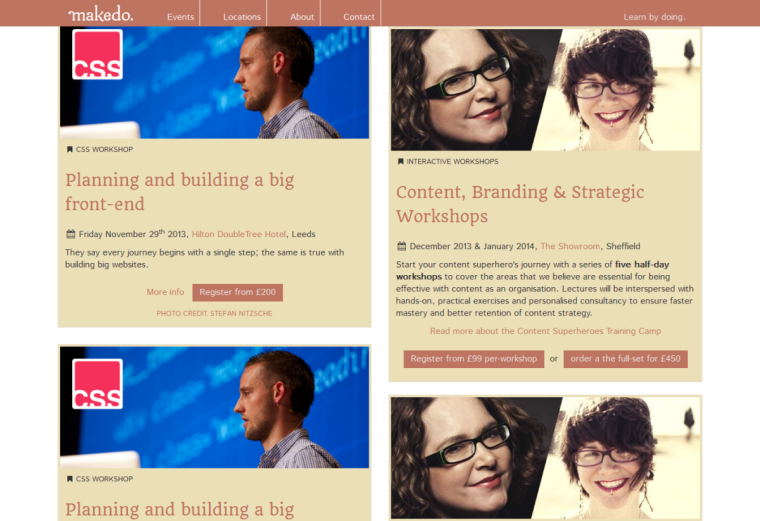
One aspect that needed work on the new site was the use of the ‘event cards’ which were introduced back in the first version. The colurs and contrasts just weren’t right on a plain white background so I played around with a few variations and shared with a few people for feedback:
What I went with
In the end the darker design won out – this was actually launched as this:
General feedback for this design is a lot more positive. It still needs work and playing around with but it’s on the right track. One thing that I feel is missing is the ‘card’ element, where each event is given more focus in it’s own box, this will eventually come back – just watch.
For now, check out the new changes over at Make Do.


